How to build a landing page that converts paid ad traffic
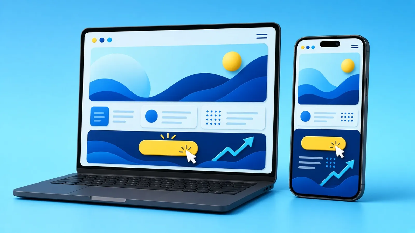
You can make the best video ad in your industry and still lose money if the click lands somewhere confusing. Paid traffic is impatient. People arrive on a phone, mid-scroll, with a few seconds of attention to spare. A landing page built specifically for that moment is often the cheapest way to make every ad dollar work harder. Here is what it needs.
Landing page vs homepage
Your homepage has to serve everyone: new visitors, returning customers, job seekers, suppliers. It has menus, multiple services and lots of choices. A landing page has one job: get the person who clicked a specific ad to take one specific action. Fewer choices means less confusion, and less confusion usually means more leads.
That does not mean you never send ad traffic to your website. It means the page they land on should feel like the next scene of the ad they just watched.
1. Message match
The headline should echo the ad. If your video promised "same-day brake repair" or "a free design consultation", the first thing people see should say exactly that. When the page matches the promise, visitors feel they are in the right place. When it doesn't, they hit back.
If you run several ad angles, consider several versions of the page, each with its own headline and hero image, while keeping the rest of the page the same.
2. Built for phones first
Most social ad clicks happen on mobile, so design for a phone screen first and the desktop second.
- Headline, a one-line explanation and the main button should be visible without scrolling.
- Buttons should be large enough to tap easily with a thumb.
- Text should be readable without zooming.
- Click-to-call and tap-to-message should work where they make sense.
3. Speed
A slow page wastes ad spend before anyone has seen it. Compress images, avoid heavy sliders and auto-playing background videos that delay loading, limit third-party scripts, and use good hosting. Test your page with Google's PageSpeed Insights on mobile and fix the biggest issues it flags. In-app browsers inside Instagram and TikTok can be slower than normal browsers, so lighter is better.
4. A clear structure
A reliable layout for a paid-traffic landing page:
- Hero: headline that matches the ad, one sentence of explanation, primary button.
- The offer: what they get and why it is worth their time.
- How it works: three simple steps, so the next step feels easy.
- Proof: real reviews, photos of real work, certifications or guarantees. Only use proof you genuinely have, with permission.
- Objections: a short FAQ on price, timing, location or process.
- Repeat the call to action at the bottom.
5. One primary action
Decide what a conversion is: a booked call, a form, an order, a phone call. Make that the main button everywhere on the page. Remove or shrink anything that competes with it, like a full navigation menu or links to unrelated services.
6. Forms that people actually finish
- Ask only for what you need to follow up. Every extra field reduces completions.
- Use the right keyboard on mobile (email and phone inputs).
- Tell people what happens next: "We'll text you within one business day."
- Show a clear thank-you page, which is also the ideal place to fire your conversion tracking.
7. Bring the video with you
If the ad worked because of a video, use the same face, footage or style on the page. Continuity builds trust. A short, muted, click-to-play version of the ad or a still from it near the top reminds people why they clicked. Just keep it lightweight so it does not slow the page down.
8. Tracking done properly
Your ad platforms can only optimise for results they can see. Before launch:
- Install the Meta Pixel and Conversions API, the TikTok Pixel and Google tags as needed.
- Track the real conversion (form submitted, call clicked, purchase), not just page views.
- Use UTM parameters on ad links so you can see which campaigns produced which leads in your analytics.
- Test every form and button yourself before spending a dollar.
9. Test one thing at a time
Once traffic is flowing, improve the page like you improve ads: test the headline, the offer, the hero image or the form length one at a time. Big swings (a different offer) usually teach you more than tiny ones (button colour).
A quick landing page checklist
- Headline matches the ad's promise
- Main button visible on a phone without scrolling
- Loads quickly on mobile data
- One clear primary action
- Real proof, used with permission
- Short form with a clear "what happens next"
- Conversion tracking tested end to end
- Privacy policy linked, especially if you collect personal information
Where Hook Lab fits
We see websites as the landing spot for great ads. We build landing pages designed for paid traffic for C$990, and five-page websites for C$2,490, and our monthly ad plans start at C$1,500. If you are still deciding where to advertise, read TikTok ads vs Meta ads, or start with our guide to video ads for small business. Ready to talk? See our website packages or ask about a landing page.
Want us to make the ads for you?
We script, shoot and edit scroll-stopping video ads, run them on Meta, TikTok and Google, and build the landing page they send people to. Monthly plans start at C$1,500.
See packages Get a free ad audit